How it works in short
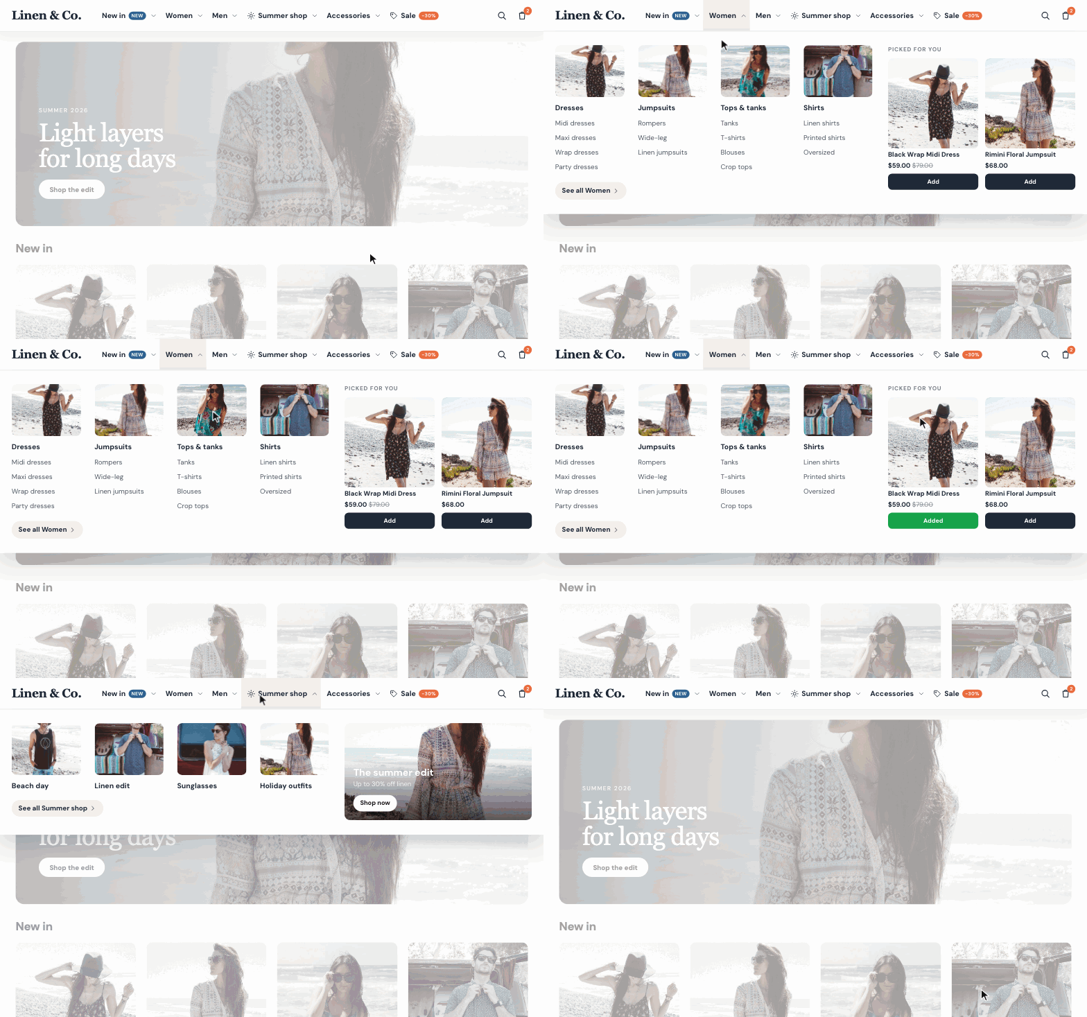
You don't build the menu by hand. The app reads your categories and puts them in the menu, with their subcategories. You only change what you want: the layout, the order, names, images, banners and products. New categories show up in the menu by themselves.
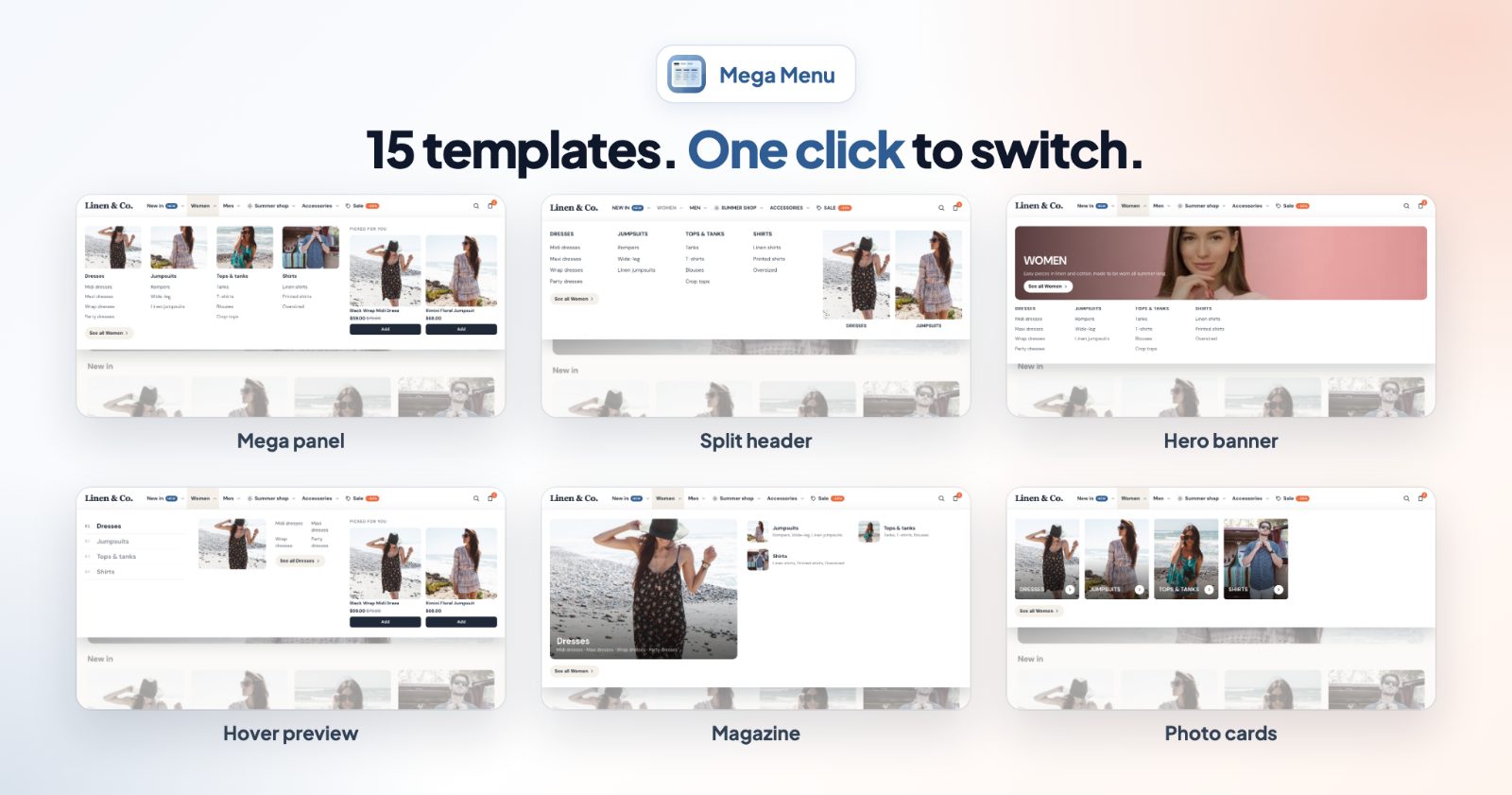
- On computers: 15 new templates, such as Mega panel, Tabbed, Image grid, Split header, Hero banner, Hover preview, Magazine and Photo cards, plus the classic ones.
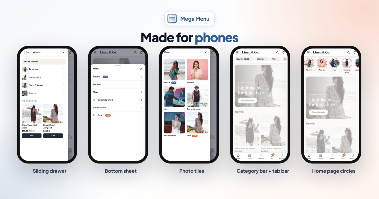
- On phones: its own layout, such as a Sliding drawer, Bottom sheet, Full screen, Photo tiles or a Category bar, plus a tab bar at the bottom and a category bar on the home page.
1. Pick a layout for computers and phones
Open the app. On a new install the menu already holds your categories. On the Layout tab, switch on Show on desktop and pick a template, then do the same under Show on phones. Each template card says what it does, for example "Columns with images, banner and products" for Mega panel or "Levels slide in, 'See all' on each, images" for Sliding drawer.
Depending on the template you can also switch on subcategory photos, the Category description at the top of a panel, and set the Width and Columns.
Using the menu since before the update? The Classic templates look exactly like before, so custom CSS written for them keeps working. Panels, banners, products and badges need a new template.
2. Arrange the menu items
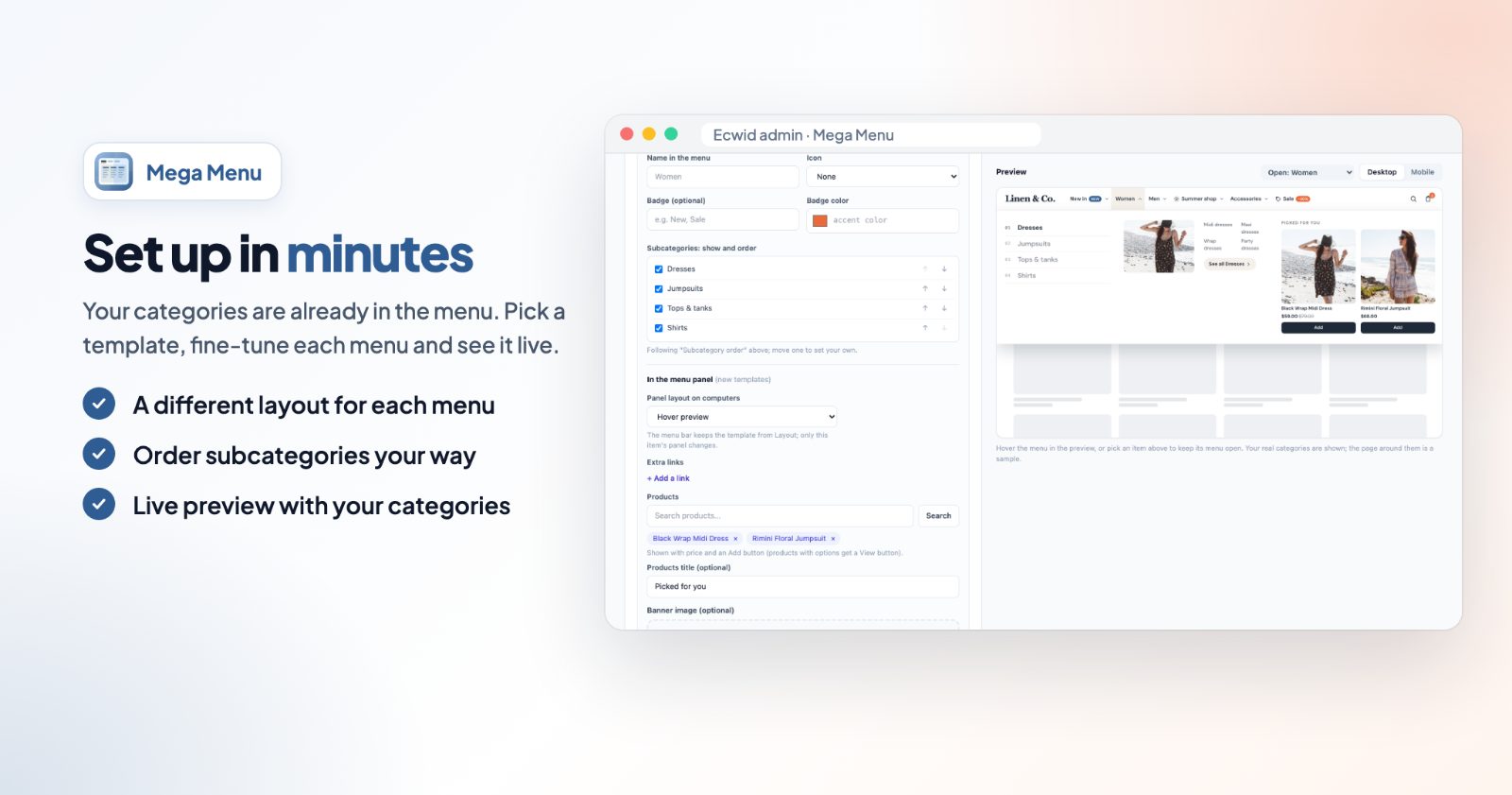
On Menu items you reorder the top items with Move up and Move down, rename or hide them, and add your own links under Add a link (a blog, a size guide, a page outside your catalog). Subcategory order sets how subcategories are sorted in every menu: As in your store, Alphabetical (A-Z or Z-A), or Most products first.
Open an item to give it more:
- Name in the menu, an Icon, and a Badge such as New or Sale with its own color.
- Subcategories: show and order: tick the ones to show and put them in your own order.
- Panel layout on computers: give this one item its own panel. The menu bar keeps the template from Layout.
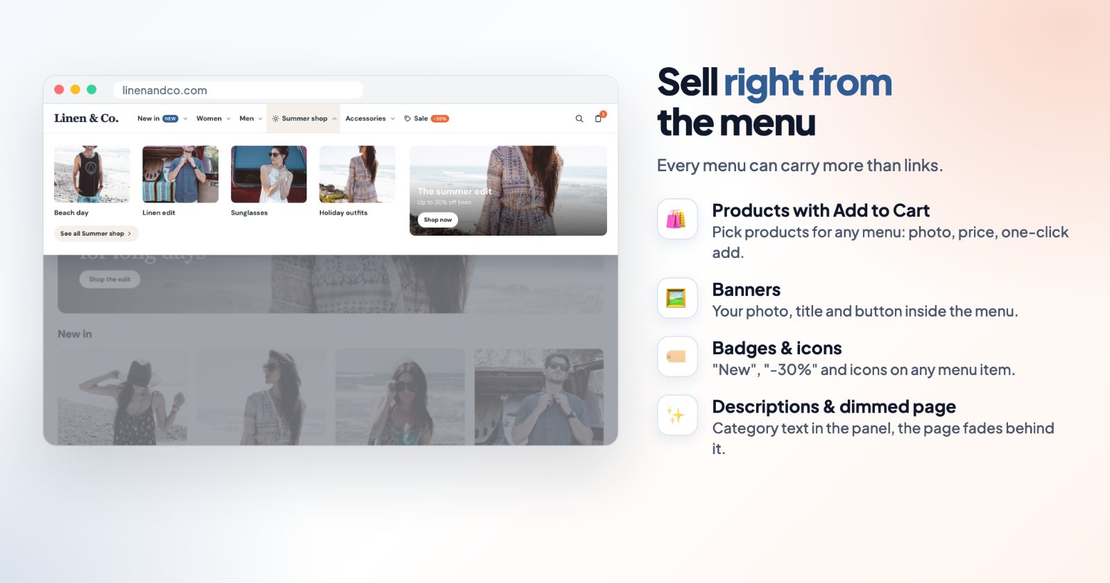
- Extra links, Products (shown with price and an Add button; products with options get a View button) and a Banner with your image, title, text, button and link.
3. Design and behaviour
On Design, Quick looks set the colors in one click (Clean white, Midnight, Warm cream, Navy, Forest and more), and you can change the bar and dropdown colors and the accent for badges. In the bar adds your logo, search, cart with count, phone, email, a language switcher and product counts.
Under Behaviour:
- Stick to the top when scrolling and Highlight the current category.
- Dim the page while a menu is open, to put the focus on the open panel (desktop).
- Add to cart buttons on products in the menu.
- Open on hover after a short delay, so menus don't flash open when the mouse passes by.
4. Phone extras
The Mobile extras tab has two things phone shoppers use a lot:
- Bottom tab bar on phones: Home, Shop (opens the menu), Search, Cart and Account always in reach. Reorder them and pick the colors.
- Category bar on the home page: a scrolling row of your top categories under the menu, as Image circles or Chips, with an optional title like "Shop by category". You choose where it shows: phones, desktop or all devices.
5. Choose where the menu goes
On Placement, under Where the menu goes:
- Replace the store header: the menu takes the header's place. Your store header is hidden, not deleted: it is hidden on every screen size while the menu is on, and comes back when you turn the app off.
- Top of the page (above everything, including the store header), Above the products or Above the footer. Your store header stays as it is.
- Before an element or After an element, with your own CSS selector.
Phones can use the same place or a different one, under On phones.
6. Preview and switch it on
The Preview shows your real categories, on desktop and on phones. Hover the menu in the preview, or pick an item to keep its menu open. If your store has more languages, the Translations tab renames menu items and texts per language. Click Save, then Enable.
Common setups
A clothing store with many categories
Pick Mega panel on computers and Sliding drawer on phones. Add two best-selling dresses to the Women menu under Products, so shoppers can add them right from the menu.
Promote a sale or a collection
Open the Summer shop item, add a Banner with your photo, "Up to 30% off" and a Shop now button, and give the item a Badge such as Sale. The badge shows in the menu bar.
A small catalog
Use Photo cards or Image grid on computers, Photo tiles on phones, and the home page category bar with Image circles.
Keep your theme's header
Choose Top of the page or Above the products instead of Replace the store header. Your header, its logo and search stay as they are, and the mega menu shows above it or above your products.
Questions
Does it delete my store header?
No. With Replace the store header, the header is hidden while the menu is on. Turn the app off and it is back. With the other positions, the header isn't touched.
I see my old menu for a moment before the new one. How do I fix it?
With Replace the store header, the theme's header can show for a moment while the page loads. To keep it invisible from the start, add this in your store admin under Website, SEO settings (custom code):
<style>.ins-tile--header,.cover__header{visibility:hidden;animation:iaMmShow 0s 3s forwards}@keyframes iaMmShow{to{visibility:visible}}</style>The header keeps its space while it's invisible, so nothing jumps when the menu takes its place. If the menu ever doesn't load, your original header comes back by itself after 3 seconds, with its menu, search and cart.
Can I change the order of categories and subcategories?
Yes. Reorder the top items with the arrows, and for every category choose how its subcategories are sorted, or set the order by hand.
I use a custom website and the menu doesn't show.
The automatic positions need the store's own header. On a custom site, contact us and we'll help you place the menu where you want it.
Shoppers found the category? Help them pick faster with color swatches on every product card and a quick view popup.